
Design Concept: Dining Room
- Allie Stephens
- Jan 30, 2023
- 3 min read
Updated: Feb 9, 2023
I was recently inspired by Shea McGee's gorgeous dining area in her home, which isn't a surprise as I often feel drawn to everything Shea designs.
It gave me the urge to design a new concept for The Journal that I could share with you too, whilst also sharing some of the elements that I really love about Shea's design. It's worth a read if you're thinking about refreshing your dining space in 2023 and want some tips/advice on how to achieve this kind of laid-back living vibe that I talk about so much!
Studio McGee Inspiration:


5 Things I Love About Shea's Design
It's simplicity - there isn't a huge amount going on in this design. The bare minimum is enough to let the design speak for itself.
The mix of chair styles - I think matching the simple straight design on the legs of both chairs keeps the space feeling put together, but totally unfussy. It feels warm and inviting like you want to sink into it with a cup of tea and a notebook.
The balance of old and new - you know this is my favourite way to style - old-looking, rustic, terracotta-y jugs with a modern light pendant.
Organic textures - the light fixture and curtain rails are metal. I think they work so well with the wooden table and chairs. The jute on the base of the chairs is that perfect middle ground that connects the dots.
The curved table - In a standard British home, we don't tend to have the same height and grand space for our dining areas as they do in the US, and, they can feel like a bit of a squeeze to walk around. I love the curve element and feel like this softer approach can do wonders over here.
ASI Design: Living Room
Here's the design concept that I worked on, incorporating all the design details mentioned above, like the curved dining table, the organic textures, and the rustic decor. I decided to go for a darker wood for the table and chairs. I think this darker wood tone is going to be gracing a lot more of our interiors over the next year or so and I am here for it. I haven't talked about our kitchen plans for the #asirenovation yet, but I know that there will certainly be features of this darker wood tone in our future kitchen!

In this living room concept design, I brought old and new together with this gorgeous reclaimed wood floor from a company called Lubelska who has the most stunning reclaimed terracotta tiles too, go have a look if you're in the market for flooring!
I added a pop of colour with this gorgeous rug from Home At First Sight. Monika, the owner, has a serious talent for finding the most beautiful pieces of home decor, I honestly don't know how she lets them go! I'd certainly struggle!
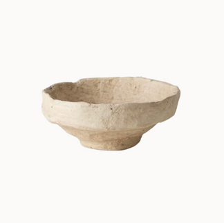
I added organic textures in the window treatments, linen cushions, paper mache decorative bowl, and faux olive tree, whilst modernising the design with a simple black art print and modern chandelier. I really love this picture light, it's an old bronzey colour with traditional detailing, that compliments the simple black picture frame. But to keep the balance right, the artwork is a simple pencil drawing that perfectly blends everything together.


So, what do you think? Leave me a comment, or drop me a DM on Instagram. I'd love to hear your thoughts!
FYI, this post contains affiliate links to some of the products. Thank you for shopping through my links, it means a lot to me. Even though it's only pennies, any commission I earn goes back into ASI and funds things like keeping my website running. I only share pieces I truly love and think you will too, so I appreciate your support more than you'll ever know.


Comments